Table of contents
What is a Pop Up or a Pop-up window?
A pop-up is content that appears automatically in the visual interface of websites when a visitor is browsing. It usually dims the background, partially or completely disables content and may include a CTA or a call to action.
Pop-ups can be of different types or formats, such as full screen, sidebar, lightbox or banner.
What they are for
Pop-ups are designed to capture the attention of the user when browsing.
Used well in front of the right visitors, they allow you to achieve high conversion rates.
So, they are a great way to grow your distribution list, push offers to users as they browse, or promote specific content or advertisement.
Combined with the right Lead Magnet and a good CTA they achieve double-digit conversion rates.
In fact, this is what the guys at iPaper found out after analyzing 2 billion popup impressions:
- The average conversion rate of all pop-ups is 3,09%.
- The number of people who see a pop-up for the first time engages with the brand with a conversion rate of 11%.
- The average conversion rate of the best pop-ups was 9,28%.
As you can see, pop-ups are very effective in achieving high conversion rates.
But this comes with a cost.
In general, pop-ups are perceived as annoying by users and they have a negative impact on the user experience if they are not used carefully.
For this reason, since January 2017 Google has penalized websites with intrusive interstitials.
This basically means that if a pop-up or any secondary content on your website does not relate to your products, brand or enhance the customer experience, it will have a negative impact on your Google rankings.
Examples of Pop-up and Popular Pop-ups
Here are some of the most popular pop-ups on websites:
1. Lightbox Popup
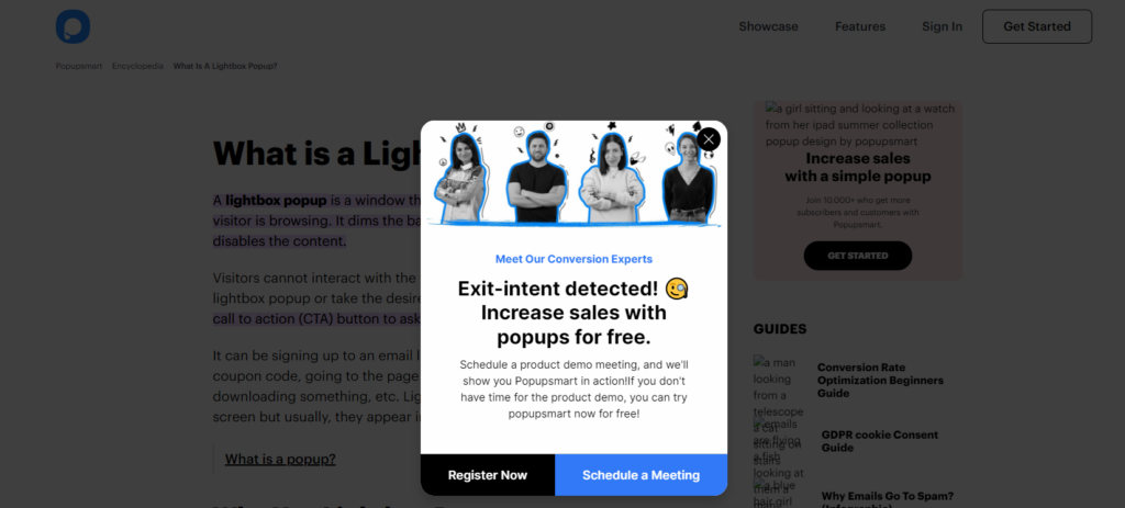
Lightbox pop-ups are the most common type of pop-up.
In fact, they are a classic.
I am sure you have seen them more than once.
They appear in a new, smaller window on the web page you are browsing.
When a pop-up lightbox is activated, it makes your browser background look darker to grab your attention.
Although lightbox popups can be used for many purposes, they are most used to grow your email list or to present your website’s browsing Cookies.
2. Exit-Intent Pop Up Form
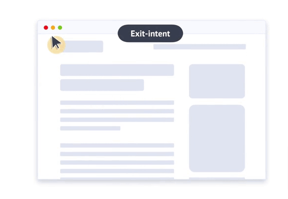
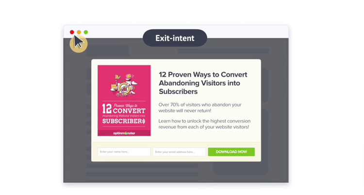
Exit-Intent pop-ups are a great way to win back visitors when they are leaving your website.
These Pop-Ups are activated when the user moves the mouse over the edges of the browser window.
It is then that it unfurls, calling for attention to prevent you from leaving the website.
The advantage of this type of pop-up is that it is only activated when the users make a gesture to leave and therefore does not affect the user’s navigation, who can move around without being disturbed.
This is very important because 70% of people who visit a website never come back.
3. Fullscreen Welcome Mat
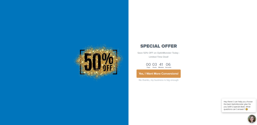
Full-screen pop-up windows are more aggressive than a standard pop-up lightbox.
These cover the entire screen of the user.
They are a good way to make sure to catch a visitor’s attention. But at the same time, they are very intrusive.
If you are going to use this format, make sure you clearly show the button to close them.
Also, if you do not want to risk having a penalty, we only recommend activating this type of window in the desktop versions.
And not for all your pages.
4. Floating Bar Pop Up
Another type of unobstructive pop-up is a floating bar. These usually look like this:
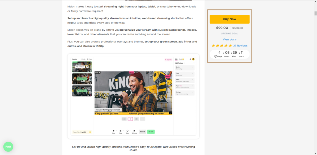
It can be argued that floating bars are not pop-ups because they are usually fixed web elements.
However, rules can be applied to them so that they appear when and where we want them to.
The same as a standard lightbox popup.
In other words, floating bars can be transformed into dynamic elements of your website by showing them to visitors at key moments in their journey. Their advantage is that they are unobtrusive, allowing the content of the website to be seen at all times and do not necessarily affect the user experience on the mobile version of your site.
They are certainly not the best conversing pop-up, but they allow you to play it safe.
5. Slide-in Scroll Box
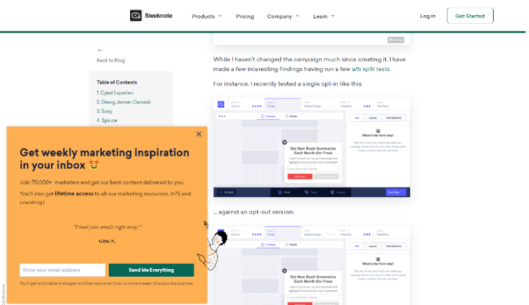
This type of pop-up is subtle and at the same time effective.These are small sidebars that appear on your site as the user scrolls down while reading a piece of content.
These are therefore displayed as part of the browsing experience and appear as if they were a slide without interrupting the navigation.
This avoids affecting the user experience too directly.
6. Inline Forms

Inline forms are pop-up forms that are activated by hovering over but appear embedded in the content of a website.
Usually, a blog post entry or a web article.
They are not pop-ups as such, as they are not displayed as a pop-up window.
But they usually work very well with audiences that are closely aligned with the topic which it is about.
Especially in training websites.
They are generally used as a subscription form to capture leads into the sales funnel.
It is rare to use them to make offers.
Think of them as images that are loaded by the lazy load.
7. Links
These are certainly the least intrusive pop-ups.
These are only activated when the user clicks on a link directly.
This is when the pop-up window appears. This implies that the user himself has shown a prior interest in the message to which he has been exposed.
This explains its high conversion rate.
As a result, you can expect much higher conversions.
How to create Pop-ups that Convert – Best practices
Pop-ups are a very useful tool for interacting with site visitors.
They help you to attract users to your email list, increase sales, recover abandoned shopping carts and much more.
However, interstitials and models are also an element that can easily ruin the user experience.
Google warns us in its guidelines that it only accepts three types of pop-up windows:
- Consent to use cookies
- Age verification
- And floating banners/bars that do not affect the user experience.
Apart from this, any pop-up can negatively affect your SEO efforts.
Here is what we recommend to protect your ranking:
- Whether it is possible to turn off pop-ups for traffic from search engines.
- Avoid loading your pop-up immediately
- Ensure you create separate versions for mobile and desktop.
- Allow users to easily close pop-up windows.
- Avoid blocking content
- Use the proper format for pop-ups
- Indicate a convincing CTA
- Include visual elements
- Offer additional incentives
- Do not abuse: show only a pop up to new users
- Set triggers well
With these tips, you are now ready to start using pop-ups on your own site riskless.
In conclusion:
Pop-ups are an excellent tool to capture attention and get conversions for newsletters, sales funnels or launch offers.
Their conversion rates are high and used responsibly they are a great help.
But they have also their dangers.
Especially because Google does not like interstitials and pop-ups as they are detrimental to the usability and user experience of your website.
In addition, Google may associate pop-ups with malpractice or fraudulent websites.
That is why we recommend you deactivate them from the mobile version of your website or only activate them on essential pages such as:
- Landing pages,
- Sales pages
- High traffic URLs
- Non-indexable business URLs
- Informational URLs where you can offer a valuable lead magnet
- Create different pop-ups for each version (desktop and mobile) of your website.
Another alternative is to activate the triggers to show the pop-up only to users who meet certain conditions: time spent, clicks, certain navigation path, etc…
Or disable any pop-up for visits from search engines.
This way you will avoid penalties and ensure that you are improving the user experience.
Links and recommended reading:
Frequently Asked Questions
A Pop-Up is a very widespread resource among marketers that is shown to visitors of a website automatically on the browser screen and serves to increase the conversion rates of a website in general. To find out what they are and how to use them, we recommend you read our article in depth.
A pop-up is a double-edged sword as it affects the user experience. To get the most out of them, we recommend following these steps → Exclude pop-ups for search engine visits → Delay the loading of pop-ups → Use a different version for mobile users → Avoid blocking content → Allow any pop-up to close easily.
