Table of contents
What is a Banner? definition, examples and costs
Banner ads, or display ads, are digital advertisements in rectangular graphic format in standard sizes that are displayed in the header, footer or sidebars of websites.
That is to say, in the most visible areas of a website to capture the user’s attention.
It is important to note that banners use images instead of text to attract the viewer’s attention.
Why are they important and… Do they still work?
The purpose of banner ads is to promote a business and generate traffic to the website of the company that publishes them.
The user can click on the banners, which link directly to a landing page, sales page or homepage.
The advantage of this method of online advertising is that it allows you to create much more affordable campaigns and also makes it easier to manage budgets on a Cost Per Click (CPC) or Cost Per Thousand Impressions (CPM) basis.
This helps to keep costs down and pivot campaigns depending on whether we are looking to attract customers or build a brand.
This flexibility is what makes them so popular.
On the other hand, they are an indispensable tool in retargeting strategies.
Examples of web banners
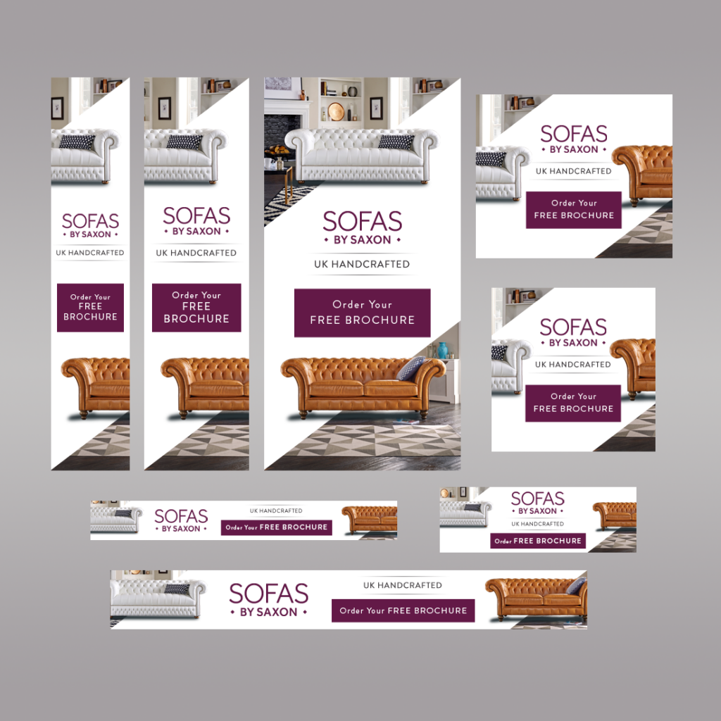
Example banners for furniture ecommerce:
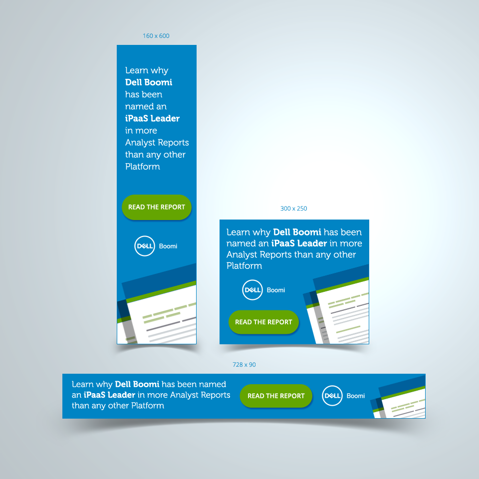
Example banner e-shop:
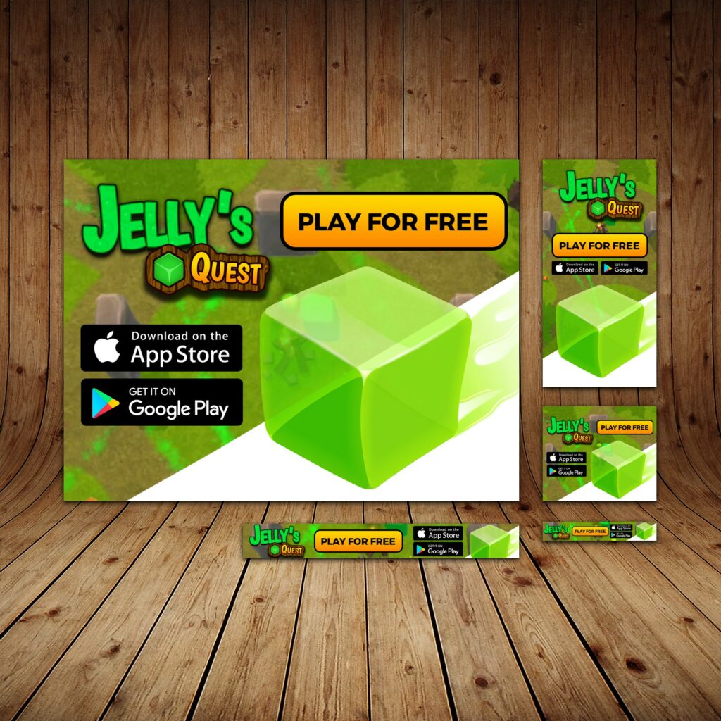
Example Banner for Games:
How to Design Banners to Get More Clicks?
While it is not easy to get users to click on a banner ad, there are several design guidelines for banner ads that you should consider when designing your ads.
These are the guidelines we follow at iSocialweb:
1. Use the most effective standard banner sizes:
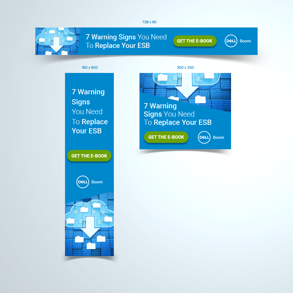
Without any doubt, the best practice here is to use the formats indicated by Google adsense.
Or,comply with the formats of the platform you are going to use.
In any case the most successful standard banner sizes are:
| Name | Dimensions (px) | Recommended Placement |
|---|---|---|
| Banner | 468 x 60 | Header |
| Half Banner | 234 x 60 | Sidebar |
| Skyscraper | 120 x 600 | Long Sidebar |
| Vertical Banner | 120 x 240 | Short Sidebar |
It is therefore advisable to design banners for each of the sizes and let Google Adsense be in charge of placing them.
2. Always place the banner above the fold or in prominent places.
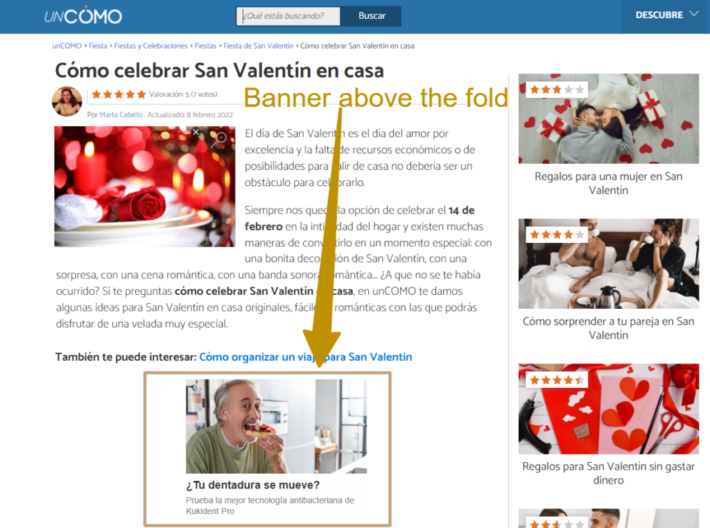
When negotiating the location of your ads try to secure the best possible spaces.
These are almost always the area above the fold or as high up as possible so that they are displayed to the user as soon as they start browsing the website.
Remember: it is always better to pay a little more to appear in the first fold than to appear in locations where the user is unlikely to scroll down.
3. Design Animated Banners
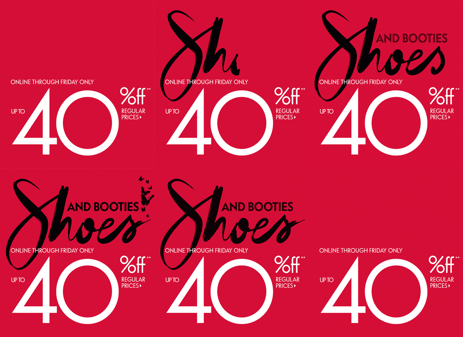
It is well established that our eyes are sensitive to movement as part of the evolutionary survival mechanisms of the human race.
That is why, when we observe movement on the screen while concentrating on reading content, an animated banner unconsciously attracts our attention.
So:
Animated banners are always better than static banners.
Tip: Use simple animations that last no longer than 15 seconds and make sure they are not repeated more than 3 times, the last frame of the animation is reserved for your call to action.
4. Maintaining the Hierarchy of Design Elements
The design of the banners is based on the right balance of hierarchical elements within each ad.
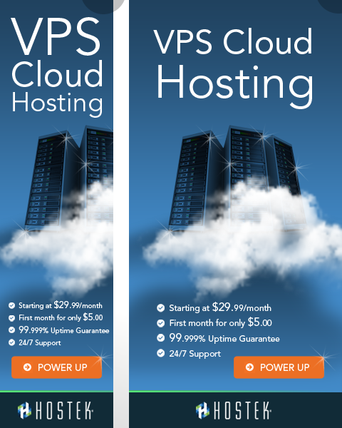
Taking care of this hierarchy is essential for an effective banner.
These are the three basic components to pay the most attention to:
The company logo:
The logo should be included to create brand awareness. Make sure it is visually dominant, but not as dominant as the value proposition or call to action. We want the user to be able to identify our brand but without detracting from the relevance of the CTA.
The value proposition
The value proposition of the product or service should be accompanied by attention-grabbing offers, benefits and attractive prices. Think of things like “Increased capacity” or “50% off today” or “Limited time offer”. This should take up the most space in your ad and be the first thing the viewer’s eyes see. Using bullet points or lists helps to synthesize and avoid excessive text.
The call to action
The CTA is the text or button that invites users to click. Phrases such as “Buy now”, “Start today” or “Get discount” are good examples of the text that a button should contain. Don’t forget that the button is the focal point of your ad where the human eye will point.
A balance between these three elements is essential for the banner to be effective.
5. Be consistent with your brand and your message.
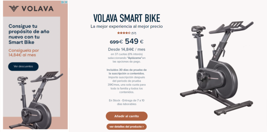
An essential but little-considered aspect of banner ad design is the match between the message and design of the ad and the landing page.
This matching serves to reinforce the user’s trust in the offer.
Thus, it is very important that the ad matches your brand.
And of course with the style of the landing page so that potential customers are not confused.
The example above shows a good message match on a landing page used for a pay-per- click campaign.
Generally, a weak message match results in a higher bounce rate and for sure in a decrease in the conversion rate.
6. Reducing File Weight and using compatible formats
As far as file size is concerned, the smaller the better: less than 150 kb, according to Google Adwords.
It is imperative that your ads load fast. Otherwise visitors will pass you by without giving them time to load.
This is more common than we think.
Especially in mobile browsing.
On the other hand, take care to use compatible file formats.
So forget about flash and use JPG, PNG, GIF or HTML5 files that will be accepted by the display networks.
In conclusion:
Banners are considered an affordable pay-per-click (PPC) advertising channel, with an average CPC of less than one euro, although this depends very much on the industry.
Businesses looking for a cost-effective way to raise awareness of their brand on the Internet or to initiate affordable marketing campaigns may consider web banner ads as an option.
Especially those exposed in display networks.
Of course, for a banner ad to be effective, it must be well designed.
The best ads are often created by experts who design high quality web banners that are eye-catching, resulting in a higher return on ad spend.
At this point having a specialized PPC agency is the best option to outsource.
Important: While ads displayed by Google have an average CTR of 2%, display ads show a very low CTR of around 0.06%. This is due to the fact that most banners are shown to an audience that has no purchase intent and that most banners are ignored by users or blocked in browsers.
Links and recommended reading:
Frequently Asked Questions
What is a Banner?
A banner is an ad format usually used in display networks and is often used to capture leads or close sales. To find out how to use them and how to use them, we recommend you read our article in depth.
How to make an Effective Banner?
Follow these steps if you want to create a banner that maximizes your CTR: 1º → Use several designs, including the most popular sizes 2º → Place your banners in the Above the Fold 3º →Use animated banners → 4º Respect the hierarchy of the elements Logo, CTA, USP → 5º Create a consistent design with your brand 6º → Reduce the file size for fast loading.
