Having trouble optimizing conversions from your website’s banners?
This is exactly what happened to one of our clients.
In these cases, our experience tells us that A/B testing through banner testing is the technique you need to employ to dispel any doubts.
Next, we will delve into a remarkable success story led by Fran Devesa, who spearheaded the CRO team at iSocialWeb. They achieved an impressive 53% increase in conversion rates in just thirty days through efficient banner testing.
Aren’t you already curious?
If so, read on to find out how we get these numbers.
But first, allow us to give you some keys to this case study:
Key learnings:
- A/B testing on banners can achieve significant increases in conversions.
- In this particular case, our client achieved an impressive 53% increase in conversions in just 30 days through a simple strategic test on one of their banners.
- Banner testing is widely underestimated among digital marketers practitioners, despite being a great opportunity to improve conversion rates and ROI of digital assets.
- Choosing meaningful metrics for success, ensuring statistical significance and properly structuring A/B tests are essential steps for effective banner testing.
Overview: How to attract more advertisers from product listings
This success story is even more remarkable considering that our client, a multilingual classifieds website, competes against significantly larger and well-established competitors in the European market.
If you run a listing portal, this story may sound familiar to you:
The business model of classified advertising portals, such as Craigslist or eBay is based on creating a platform that allows individuals and companies to post ads for goods or services they wish to sell or buy.
These portals facilitate the connection between buyers and sellers, and their business model relies on advertisers’ subscriptions, which generate recurring revenue streams for the marketplace owners.
Therefore, one of the big challenges facing a classifieds website is to convince potential advertisers to subscribe and pay a monthly fee for their ads.
Without them, it is not possible to generate either page listings or revenue.
Therefore, our client priority request to us immediately after we assisted them in optimizing the landing page and form was:
To get as many advertisers as possible in less than 30 days.
So, as you can imagine, the challenge was how to accomplish it within such a short timeframe.
The big challenge: Where to act to test a conversion element
From the beginning the problem was evident.
The areas focused on acquiring advertisers had already been optimized, and the remaining conversion elements were tailored towards potential buyers within the platform. Therefore, the question arose:
Where should we intervene to attract potential advertisers?
To address this, certain key factors were essential:
- Identifying a website location with a substantial amount of traffic to ensure significant results.
- Ensuring that any changes made would not adversely affect the other conversion elements.
Consequently, a solution had to be devised that could generate a sizable sample and deliver significant outcomes for the client within a brief timeframe.
Fran quickly proposed a simple yet effective strategy to tackle two challenges simultaneously.
He formulated the following hypothesis for validation:
“Most advertisers visit the ad listings to assess the competition and compare offers with their own. Therefore, it makes sense that if they observe a competitor in the ad list, it implies profitability and success. Consequently, it becomes a compelling reason for them to showcase their own offers alongside the competition. This presents precisely the right moment to encourage them to register on our platform and initiate further engagement.“
How was this achieved? Quite simply:
By creating banner ads to be displayed in the product categories section, where all the advertisers’ offers are listed.
This strategic placement aimed to capture their attention and prompt registration, akin to casting a fishing line.
The solution: A/B testing for banners on product and service listing pages.
Fran’s proposal was not without risks, but it was deemed worthy of testing to address any doubts.
The chosen location, the product pages, attracted substantial traffic on the website.
Moreover, since banners often go unnoticed by users, they have minimal impact on the user experience, making it an advantageous choice.
Thus, we implemented Fran’s idea and conducted an experiment on these pages.
We created two banner versions to be displayed to users, employing an A/B test methodology to optimize conversions.
The process: How we did it
Following best practices for of A/B tests, we chose to create banners with the message:
“Are you interested in appearing in this listing?”
Creating two different versions for this case:
The first version was more eye-catching, while the second was more discreet.
It was decided to use the more discreet version, as most of the visitors to the site were customers looking for classified ads.
The more discreet version was designed to go unnoticed among the real photos and illustrations of the other ads in the listing so it won’t impact on user experience.
Also, each banner versión had two different sizes.
1. A rectangular one for the desktop devices:
It was chosen to display the banner in landscape format behind the first 4 listing items displayed in a grid. The position was made clear to the client and can be varied according to the needs of the page.
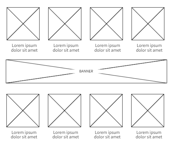
And the other quadrangular for the mobile version of the page, maintaining the same layout as depicted in the previous diagram (Figure 1).
It is crucial to highlight that the client’s website supports 7 languages, resulting in the creation of 7 banners for each language in both the desktop and mobile versions.
Therefore, a total of 14 designs were developed to conduct the test across the various languages.
2. The tool: Google Optimize
This test was carried out using the Google Optimize tool, showing 100% of the visits one of the two versions designed to first measure the impact on conversions and decide which design was more effective.
At this point the most important thing was to respond and set up the A/B test quickly and with guarantees.
Remember that we had a very ambitious mandate from the client:
To capture additional subscribers in less than 4 weeks.
Well, thanks to Fran’s experience and the willingness of the client’s team, we were able to set up the banner test very quickly and effectively.
By the end of the experiment, we had managed to display the banner more than 9,000 times and captured a total of 38 new subscribers in 30 days.
More than one new advertiser every day.
But we’re sure you want to know which banner was the overall winner of the test.
And by how much margin.
Good for you!
Skip to the next section to find out and kill your curiosity.
The results: 38 new advertisers signed up in 1 month
As you know, banner testing involves creating multiple banner variations and running them simultaneously to see which one works best.
In this case:
The banner test identified a variation that resonated with our client’s audience much better than expected.
As you can see below:

Actually, we did not anticipate substantial differences between the two banners.
Since the designs were similar and the expected impact was not heavily reliant on the design itself, we presumed minimal discrepancies.
However, the outcome surprised us: variant 1 yielded 53% more conversions.
If we had utilized the latter version, we would have obtained 50 new customers instead of 38.
In any case, we surpassed the client’s expectations by a significant margin.
Making a substantial impact on their bottom line.
In conclusion: Banners continue to provide value for conversions
Our success story on how to achieve a 53% increase in conversions through banner testing highlights the immense potential of this format to engage customers.
It also underscores the value of A/B testing in enhancing advertising performance. In our experience, this advertising resource has often received a negative reputation and remained underutilized.
However, in this specific case, it proved instrumental in achieving the following:
- Capturing a significant volume of new subscribers.
- Enhancing the ROI of product listings through a new income source.
By analyzing and optimizing crucial elements such as images, call-to-action buttons, and landing pages, it becomes possible to effectively improve conversion rates within a short timeframe.
Nevertheless, as demonstrated in this case, other factors also play a vital role in optimizing conversion rates.
Therefore, the right approach, expertise, and tools are essential.
At iSocialWeb, we possess extensive experience in optimizing web projects, consistently delivering favorable results.
Do not miss the opportunity to improve your ROI and boost your revenue.
Contact us today!
Head CRO and co-CEO of iSocialWeb. CMO of Growwer. Specialist in conversion optimization and Experiential Marketing.
- Este autor no ha escrito más artículos.


