Table of contents
What is a Landing Page?
A landing page is a stand-alone web page within a website designed for the sole purpose of generating leads or sales for a specific digital marketing campaign.
Therefore, it is the URL where users arrive after clicking on an email, advertisement, web link, or any other digital placement.
Why it is important
- Subscribing to a mailing list
- or Purchasing a product or service
Types of Landing Pages
If we consider the purpose, there are two types of landing pages:
Those that seek to close sales, i.e. are 100% transactional and are known as sales pages.
And those that aim to capture leads or subscribers to feed sales funnels.
Both typologies work under very similar design principles and elements.
However, the differences in copy, images, lead magnets and CTAs used are important.
Anatomy of the Perfect Landing Page
- A unique selling proposition (USP)
- A main image or video
- The benefits of the offer
- Some form of social proof
- CTA
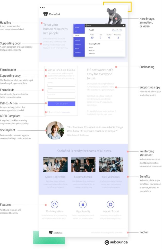
Here is a summary of what each of these elements consists of:
1. Unique Selling Proposition
A unique selling proposition or USP is a title in which we make clear the specific benefit of your offer, product, or company that makes it stand out from others in the market. What you need to answer is the following question: What makes your offer so special? The USP can be broken down into four page elements:
- The main headline
- The supporting subheading
- The reinforcing statement
- The closing argument
And together they display the benefits of your offer across the entire landing page:
Hero Shot: One Main Featured Image or Video
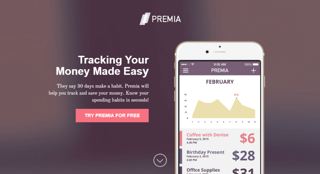
Also known as “Hero Shot”, the idea behind this component is to use a high-quality graphic element that reinforces our message. This usually translates into:
- A main photo of the product, graphic image or service,
- Large space and highlighted as something worthwhile.
The main image must be the highlight of the page, making it immediately clear what the offer is about, reinforcing the USP and vice versa. Both elements must work together and support each other.
3. The benefits of the offer
Making clear the benefits of your product or service involves explaining how you solve a problem your potential customers have. Exposing a list of benefits in which each one addresses your customer’s pain points will earn your landing page added value and will serve as a sales pitch. Ask yourself about your customers’ problems and then state in one sentence how your product solves them or how it does it better than the competition. Another way to do this is to transform the features of your product into benefits. For example: Imagine you sell cell phone batteries. Changing your Fast charging lithium battery to Our batteries charge your phone up to 80% in 5 min.
4. Some form of social proof

5. CTA or Call To Action
The call to action is an essential element for closing the sale. This can be in the form of a button or it can be a form for lead generation. Either way, it is essential for conversions, That’s why you should pay special attention to the design, placement, and text. We suggest you read our article on call to action , in which we address both topics in detail.Examples of Successful Landing Pages
Ejemplos de Landing Page Efectivas
Existen muchos tipos de páginas de aterrizaje entre las que elegir.
Lo ideal es crear aquel que mejor se adapte a nuestra industria atendiendo al interés de nuestros buyer persona y a continuación testar.
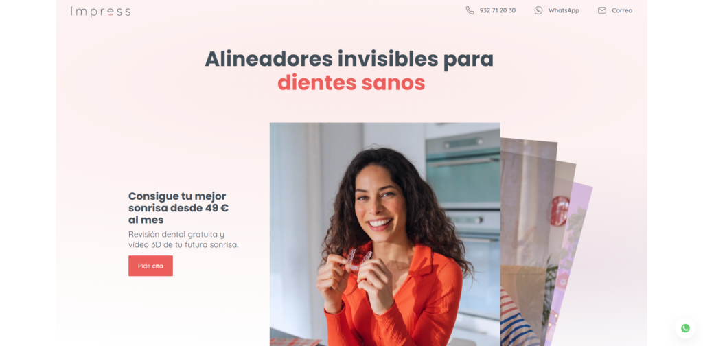
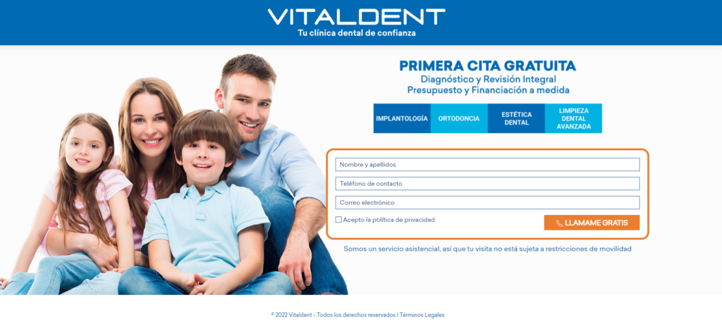
Aquí te mostramos vario ejemplos:
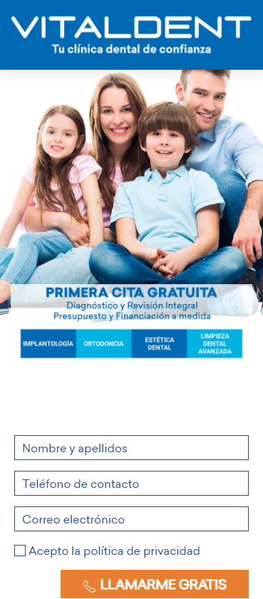
Clinica Dental:
8 Tips for Designing an Effective Landing Page
The top 25% of sites have a conversion rate of 5.31% or higher, while for the top 10 percentile the conversion rate is 11.45%, five times higher than the average.
So… What causes such different results?
Quite simply:
The right combination of the 8 principles of Landing Page design.
We recommend you to use these principles when designing landings pages:
Principle 1 – Create Anomalies to Attract Attention.
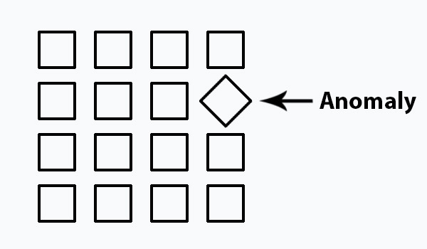
This principle consists of breaking the harmony of a uniform design by introducing a change in an element or group of similar elements to capture all the user’s attention on that particular element.
An anomaly is the presence of an irregularity in a design where regularity still prevails.
It marks a certain degree of deviation from general conformity, which is a slight or considerable disruption of the overall discipline.
Principle 2 – Eliminate Distracting Elements
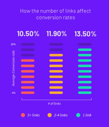
The principle of distraction in landing page design is about identifying and eliminating the elements that may be generating confusion, distraction, or user leakage. These leakage points are usually internal links that go to other sections of our website and that, if clicked, prevent visitors from moving towards the desired action. That is why we will reduce them to zero, leaving only the possibility of clicking on a single Call To Action. This translates to:
- Remove the link in the logo of our page that leads to the home page.
- Remove the navigation menu to other sections on the landing page.
- Remove the footer with all links including social media links
- Disable any internal links within the page content.
What we are looking for is to create a small cage so that the user can only move forward in the purchase by clicking on the call to action button. In this way, the only possible escape element is our call to action. Remember: No links in the footer, navigation menus, or body text. We don’t want any leaking
Principle 3 – Set the Direction
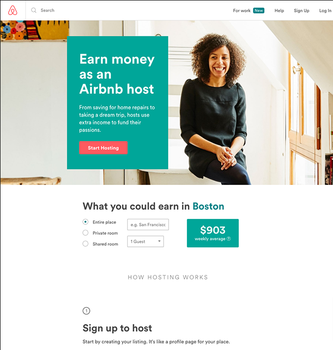
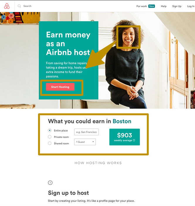
The direction principle states that landing pages should be designed so that graphic or text cues are placed to guide the user to look at where the CTA is located as smoothly as possible. The simplest resources to achieve this principle are:
- Pictures of faces with suggestive looks
- Vertical, horizontal, or oblique direction arrows.
In the example above it is very clear: The look of the landing page photo gently guides towards the CTA. It draws the user’s attention first to the headline or Unique Sell Proposed (USP). To then focus all our attention on the red button that says “Start hosting”, the principle of anomaly and contrast is applied. The next example below is even simpler and more obvious. An arrow indicates the path to follow by pointing at the CTA:

Providing directional cues to your visitors will ultimately encourage them to consider your offer.
At worst, it reduces your bounce rate.
And at best it increases your conversion rate.
That’s how simple we use the principle of direction to guide the user by creating the illusion of movement within the design.
Principle 4 – Contrast to improve readability and visual clarity
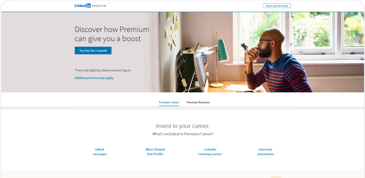
The principle of design by contrast is used to improve the readability and visual clarity of the elements of any landing page that we want to highlight. For example, Call To Action buttons. Used in the right way, contrast is a perfect way to highlight what is important within the landing page so that users focus all their attention on those sections. But how does this design principle work? Contrast is generated when there is a noticeable difference between two elements. And the easiest way to use this resource is through colors. That is, using the chromatic elements in opposition to highlight those elements of interest. The most common way to use this feature is to contrast neutral background colors (white, gray, beige) against cold colors like the one in the image or warm colors. Tip: This tool is great for calculating a good contrast ratio. You can set the color of your background and maybe your headline above it or a button, to determine the ratio of one to the other. Anything over seven is good for generating contrast and improving the readability of text and CTAs
Principle 5 – Overlapping Highlighted Elements
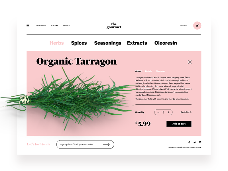
The overlapping design principle consists of using elements of the landing page that break the boundaries of shapes and sections to create emphasis and direct attention where we want. It is a visual resource that allows us to emphasize a specific area that we want to give more importance to. In the example above we use this resource to give importance to the image of the organic product being marketed.
Principle 6 – Adding Consistency to Design

Consistency is the coherence of style and appearance that is captured in elements such as fonts, color, or design style. This involves both iconography, symbols, and buttons. It also includes ensuring that the same type of illustrations, font scale, color shades, etc. are maintained throughout the layout. Generally, we recommend not to use more than two typographies, a palette, or a family of 4 to 7 colors that help to maintain a neutral and cold or a warm and dynamic combination according to the business values.
Principle 7 – Accessibility

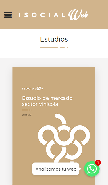
The design principle of accessibility refers to the clarity with which the design of an object reflects how it can be used by the user. For designers, it means that as soon as someone sees something, they need to know how to use it. For example, a mug has high affordance: It’s easy to intuitively figure out how to use it. A button we click on a website would be another example. So are elements with icons, such as the hamburger menu in the image or the button to open a chat or go back to the top of a website. These are all elements that the user may know how to use without having seen them before. Therefore: Our landing page must make use of all these elements to facilitate an intuitive understanding to the user, facilitating their interaction with them and ultimately leading them towards conversion.
Principle 8 – Highlighting
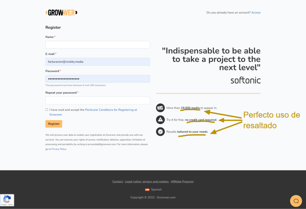
This principle is the same as the contrast one but applied only in text. Highlighting is a basic but very valuable resource. It consists of the simple use of a different color in the background of an underlined text or the use of a few simple words in bold. These highlighted texts allow you to communicate an idea very effectively and quickly to users. This is especially true when they are scanning the web content as it allows you to emphasize the pain points or points of interest of your potential customers, catching their attention and retaining them to consider your products as a solution. Warning: Studies show that the ceiling of the usefulness of highlighting is around 10% of the text. Beyond that, highlighting loses its ability to capture attention.
In conclusion:
Everyone talks about the goodness of landing pages and their great power to convert traffic into customers almost effortlessly but the truth is that the average conversion rate is around 2.35%.
At first glance, it doesn’t look spectacular.
Of course, the problem is not in the landing pages themselves but in the way they are designed and used.
Creating an effective landing page means ensuring that the user gets what he or she is looking for.
To do this, consider the following points in your landing pages:
- Create a single page per product and service
- Ensure that the style of your landing page is consistent with the marketing campaign.
- Optimize loading and responsiveness for mobile phones.
- Have a unique value proposition in the title.
- Remove all distractions, the noise and clutter must disappear.
- Use an effective Call To Action
- Limit the amount of information requested from customers.
- Use high-quality visual elements
- Provide social proof or assurances to ensure that the conversion is low risk.
- Play on the scarcity factor or offer a lead magnet to encourage clicking on the CTA.
- Test pages over and over again with A/B testing and/or heat maps to see what works and improve what doesn’t.
In short:
If you know how to create an effective Landing Page, these are a great tool to drive traffic from a marketing campaign to a specific product, service, or offer.
They undoubtedly help to improve your conversions and increase the profitability of your website.
And they even allow you to build a database of potential customers.
However, you will only get spectacular results if you master the science and discipline behind their design.
And that’s where IsocialWeb can help you, ask us for help here:
Links and recommended readings:
Frequently Asked Questions
A Landing Page is an essential resource to increase your business conversions and reduce the ROAS or cost of acquisition of your digital marketing campaigns. Knowing how they work, the types that exist and the tips to design them is essential to make your digital marketing strategies profitable.
Designing the perfect Landing Page is a combination of elements, web anatomy, and design principles. Summarizing as much as possible, every landing page should contain 5 essential elements → Element 1 – Unique Selling Proposal → Element 2 – Hero Shot: a highlighted video or graphic → Step 3 – Clear benefits for the customer. → Step 4 – Social proof and assurance to reduce friction. → Step 5 – CTA that motivates to act.
