Table of contents
What is a Call to Action (CTA)?
A Call To Action, CTA, is a resource (phrase, link, button, image, pop-up, floating bar…) used by marketers in ads, landing pages, banners, forms, product pages, emails, or any digital support designed to capture attention and encourage a user to perform the desired action.
In summary, a call to action (CTA) is any element that invites the user to perform some specific action such as buying, registering, filling out forms, downloading something, or even visiting other content.
Why it is important?
The Call to Action has a direct impact on the conversion rate of any online business.
As digital marketing professionals what we seek is to generate visits to our business, retain these visits, and convert them into customers.
Here, the CTA plays an essential role in eliminating friction at all stages of the buying process.
Therefore:
The call to action is a central element in any online business.
It acts as a clue to let the user know what to do next.
Making it easier for them to move forward in the sales funnel and optimizing conversions.
To reinforce this statement: imagine for a moment being on the Amazon website to buy some sneakers and just when you choose the ones you like on the product page you won’t find anywhere the “add to cart” button.
Surely now you can understand the role played by calls to action, right?
Call to Action Examples
There are many types of phrases, formats, and features that can be used to create a CTA.
We will outline below some common examples:
CTA for Blogs:

In these cases, the calls to action will be aimed at promoting the consumption of content within the platform itself or simply seeking to get the online visitor to subscribe to a newsletter using a hook or lead magnet.
These are some examples of calls to action that are usually seen in a blog:
- Read more articles
- Subscribe to the Newsletter
- Share content on social networks
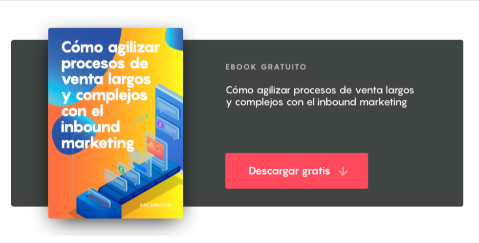
- Download Free Guide
Calls to Action for B2B and SAAS Businesses:

In the case of a B2B company, the call-to-action buttons could include text such as:
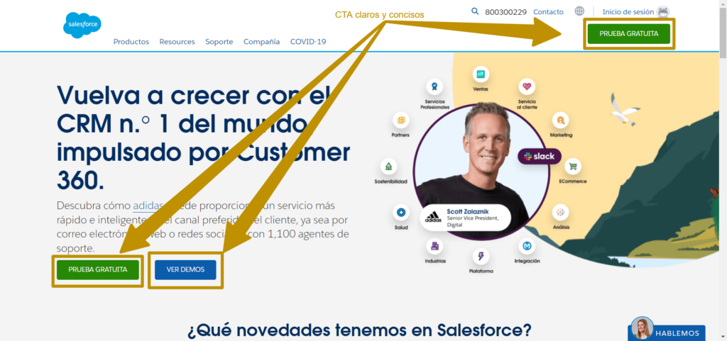
- Request Demo
- Download Now
- Create Account Now
- Free Trial
Here we are looking to establish a demo session or generate a registration form in exchange for more information or testing the software.
Call to Action for e-commerce:

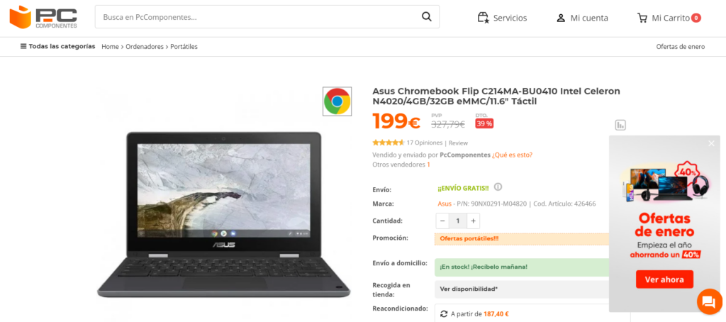
The advantage of having an e-commerce is that most of the traffic we capture is transactional, so we can be much more explicit in providing CTA’s with a business approach:
- Add to cart
- Notify when there is stock
- Buy now
- View deal
- Add to wishlist
In each case, whether it is the CTA of an offer, product, etc., the action is focused on making the different steps of the purchase process clear for the user, until the payment of the order is completed.
CTA for Service Companies:

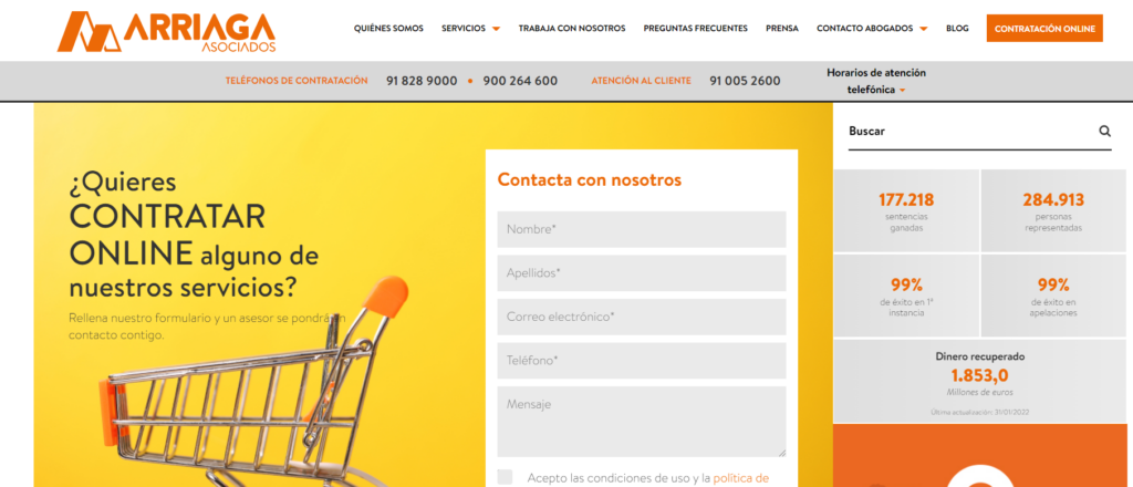
Calls to action for service companies depend a lot on the degree of involvement and urgency of the customer. The CTA of a restaurant will go straight to try to close a reservation while a lawyer or professional will need to close a first consultation through a form.
- Book an appointment
- Call me now
- Book your treatment
- Fill out form
- Set up a Free Consultation
In any case, what we are looking for with the CTA is to encourage the user to fill out the reservation request form for a consultation appointment or lunch space.
Keys to Create a Perfect CTA
Writing, designing, and implementing a CTA is a mix of art, science, and intuition.
What is relevant here is to understand at what stage of the purchase pipeline the customer is at in order to use the appropriate text and action to request.
But, what else should we take into account to create the perfect Call To Action?
1.- Use action verbs in the infinitive vs. the imperative
Although most people are used to commercial texts where the imperative verb form is used, we recommend you not to abuse this formula.
For example instead of using ¨Accede a tu prueba gratuita¨ use ¨Acceder a prueba gratuita¨
2.- Design and place the CTA to attract attention
Since the call to action should be the most visible part of the page, it should be placed where it can catch the user’s attention from the first moment.
If this is not possible, triggers can be configured to activate the call to action at the right time. For example: when the user is about to leave the page, has been on our website for a certain amount of time, or accesses the appropriate content.
It is also important to take care of the design. The best calls to action capture the user’s attention from the first moment. Using a bright button color that contrasts with the color of the page or email is an effective strategy.
3.- Write Actionable and Value-focused Text:
Stating a clear benefit that the user will get from completing the transaction is an effective way to get them to click through.
A call to action, as the name implies, is designed to encourage the user to take action, so an effective CTA should use action words such as “discover”, “learn more”, “get discount” and “buy now”.
All of these make the benefit to the user explicit in a clear and compelling way.
4.- Customize CTAs to the maximum
This is a simple thing to say, but it is a big challenge for many organizations.
The easiest way to design your Call to Action is to take into account the stages of the sales funnel in which the users are in.
In our case, we adapt the CTA to the search intent that has led the user to that page or content, but we also use intelligent CTA systems for recurring visits to identify users and expose them to the right CTA’s for their situation.
5.-Be concise
The text of a good call to action is short, summarized, and brief. Most are no longer than three to five words.
6.- Creating a Sense of Urgency and Reducing Risks
One of the added difficulties of the Internet is that users are easily distracted, find it difficult to build trust, and tend to shop between multiple options often.
A key resource to keep their attention and focus is to generate a strong sense of urgency.
Whenever possible, try to materialize your offer for a limited time by adding a satisfaction guarantee to reduce friction. This helps users act immediately rather than postpone action.
7. Test, Test, and Test
Never stop monitoring and testing your CTA’s. Using heat maps to know where to place them, to know how users interact with them and, of course, which ones generate the best conversions is essential to launch tests and experiments to improve them.
In conclusion:
What we are looking for as webmasters, developers, or website owners is:
Attract customers.
If your website, application, or sales page has a poor CTA or lacks one, the efforts to generate customers will be much greater.
Therefore:
A call to action (CTA) should serve to generate a clear and specific request to the user about what we want them to do next after being exposed to our content.
To use a valid analogy, the Call to action performs the work of a sales clerk in a physical store.
It serves as a guide for any user to know how to choose, pay, and take a product from the store.
That is why its design is essential to optimize conversions of any app or website.
Links and recommended readings:
Frequently Asked Questions
A Call to Action is one of the key resources used in digital marketing to improve conversions on your web pages or applications. If you want to master and boost conversions on your website you must understand this concept thoroughly.
Creating the perfect Call to Action is an arduous task that requires design, persuasive writing, and data. Greatly simplifying the process, you must → Design and Position the CTA to grab attention → Personalize the Message → Use action verbs → Show immediate benefits. Find the inspiration you’re looking for in our article on de CTA design.
